Using plugins
dotAtlas comes with a number of plugins that extend the core API with high-level features, such as selection tracking or dark color mode. This article shows how to use the available plugins.
Preparation
Before you can use a dotAtlas plugin you need to import the plugin class and register it
using the DotAtlas.with() method.
You can import plugin classes using ES6 modules or as ES5 globals.
ES6 modules
You can import all dotAtlas plugin classes by name from the
@carrotsearch/dotatlas namespace:
import { DotAtlas, Theme, Effects, Selection } from "@carrotsearch/dotatlas";

const dotAtlas = DotAtlas.with(Theme, Effects, Selection).embed({
  ...
});
ES5 globals
To use the ES5 globals flavor, include the desired *.min.js scripts in
your page and use the global symbols they provide.
<body>
  <script src="dotatlas.min.js"></script>
  <script src="plugin.effects.min.js"></script>
  <script src="plugin.selection.min.js"></script>

  <script>
    const dotAtlas = DotAtlas.with(Theme, Effects, Selection).embed({
      ...
    });
  </script>
</body>
Plugin properties
Plugins can contribute extra dotAtlas properties. You can provide initial values for those
properties when calling the DotAtlas.embed()
method. Once dotAtlas is initialized, you can
get() and
set() plugin properties
in the same way as the dotAtlas core properties.
The following example initializes dotAtlas with the Theme
and Effects plugins, passing the initial values
for the plugin-contributed theme and rollbackDuration properties.
Later on, the theme property is set to a new value.
import { DotAtlas, Theme, Effects } from "@carrotsearch/dotatlas";

const dotAtlas = DotAtlas.with(Theme, Effects).embed({
  "element": document.querySelector("#visualization"),
  "layers": [],
  "theme": "dark",
  "rollbackDuration": 3000
});
dotAtlas.set("theme", "light");
Combining with core API
Plugins hide the complexity of implementing common high-level functionalities, such as selection tracking – instead of dealing with dotAtlas core API, you use the high-level plugin API.
However, you can combine the use of plugin and core dotAtlas APIs to customize specific
aspects of the visualization. For example, when working with the Lingo4G plugin,
you can use its lingo4g:customize:layers
property to configure the layers the plugin creates. Or, you can use the selection:layer:hoverOutline property of the
selection plugin to get the
outline layer the plugin creates to customize its look.
AutoResizing
The AutoResizing plugin adds automatic resizing of the visualization area
on window size changes. It will call the fast-to-execute resize() method on every change of window size and will recompute label layout when window
size stops changing.
The AutoResizing plugin does not contribute any extra properties.
Theme
The Theme plugin adds the dark color scheme for rendering elevations and labels.
The plugin contributes the theme property, which accepts the light
and dark values.
import { DotAtlas, Theme } from "@carrotsearch/dotatlas";

const dotAtlas = DotAtlas.with(Theme).embed({
  "element": document.querySelector("#visualization"),
  "theme": "dark"
});
Effects
The Effects plugin adds animated "rollout" and "pullback" animations when
new layer data is set. You can define the duration in milliseconds of both effects using the
rolloutDuration and pullbackDuration properties.
import { DotAtlas, Effects } from "@carrotsearch/dotatlas";

const dotAtlas = DotAtlas.with(Effects).embed({
  "element": document.querySelector("#visualization"),
  "rolloutDuration": 3000,
  "pullbackDuration": 3000
});
Selection
The Selection plugin adds a mechanism for interactive selection of individual
or multiple markers.
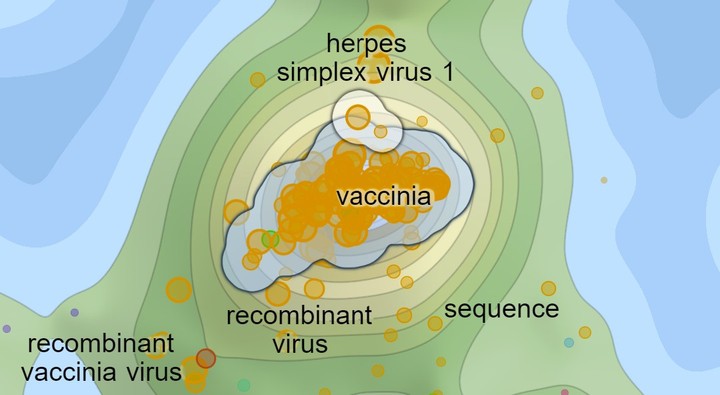
The Selection plugin tracks the markers under the mouse pointer
(outlined in white) and markers currently selected by the user (outlined
in blue).
Layers
The Selection plugin adds two extra outline layers on top of the existing ones:
- selection layer
-
highlights the currently selected markers, drawn in blue by default.
- hover layer
-
highlights the markers under the mouse pointer and ready for selection, drawn in white by default.
Interactions
The plugin listens to the following interactions:
- mouse move
- The hover layer is updated with the marker or markers lying under the mouse pointer. Which specific markers are included in the hover layer depends on the selection mode.
- click
- Selection is replaced with the current contents of the hover layer.
- Shift + click
- Current contents of the hover layer is added to the selection.
- Ctrl + click
- Current contents of the hover layer is removed to the selection.
Selection mode
The Selection plugin offers three selection modes listed below. The selection
mode determines which markers are included in the hover layer given the current position
of the mouse pointer. You can change the selection mode using the
selection:mode property.
The plugin supports the following selection modes:
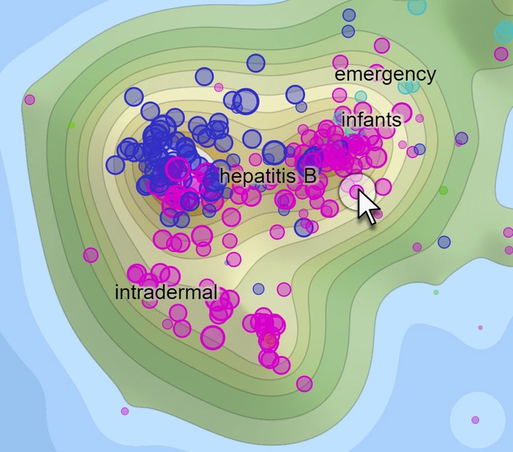
- single
-
The hover layer contains a single marker that is closest to the current mouse pointer location.
- circle
-
The hover layer contains all markers lying within a specified circle around the current mouse pointer location. The radius of the circle can be specified using the
selection:clusterRadius.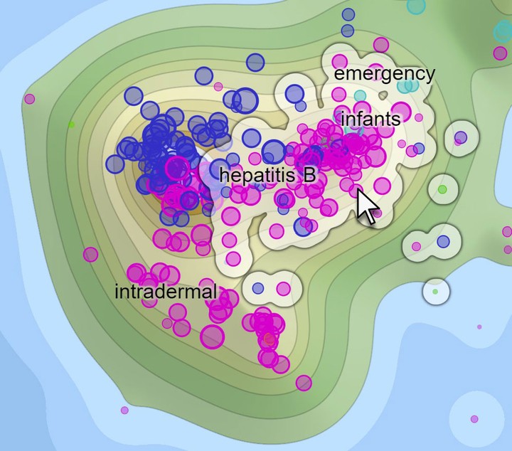
- cluster
-
The hover layer contains all markers lying in the densely-populated region of the map determined by the current mouse pointer location. The size of the region can be adjusted using the
selection:clusterRadiusproperty.Compared to the
circleselection mode, the cluster mode tends to choose markers lying close to each other. Also, the choice is more stable with respect to the mouse pointer location: if the mouse pointer moves to a different location within the highlighted dense region, the highlighted markers will not change.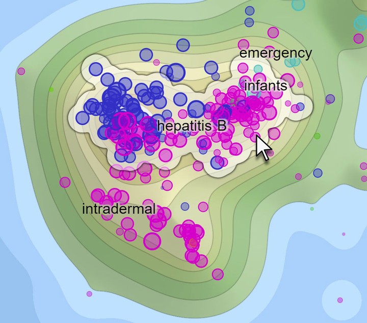
Code examples
This section shows the common use cases of the Selection plugin. For a complete
list of properties and events, see Selection plugin API.
Minimal example
The minimal code example required for selection tracking is shown below. It imports the plugin
and adds a listener for the selection:onSelectionChanged event to get notifications of
selection changes. By default, the plugin will track selection of points provided in the
bottom-most markers layer.
import { DotAtlas, Selection } from "@carrotsearch/dotatlas";

const dotAtlas = DotAtlas.with(Selection).embed({
  "element": document.querySelector("#visualization"),
  "layers": [
    {
      "type": "marker",
      "points": [ /* ... */ ]
    }
  ],
  "selection:onSelectionChanged": e => {
    console.log("Selected markers", e.points);
  }
});
Selection hover events
You can also listen to hover change events as shown below. As opposed to the core
onMouseMove event, the event
exposed by this plugin comes with an array of points lying around the mouse pointer location.
dotAtlas.on("selection:onMouseMove", e => {
  console.log("Hovered markers", e.points);
});
Changing selection programmatically
To get or set the current selection programmatically, use the
selection:selection
property. The following code sets the initial selection to contain the point at index 0 and
later on changes the selection to consist of points at index 1 and 2.
const points = [
  { "x": 0.0, "y": 0 },
  { "x": 1, "y": 0 },
  { "x": -1, "y": 0 }
];

const dotAtlas = DotAtlas.with(Selection).embed({
  "layers": [
    { "type": "marker", "points": points }
  ],
  "selection:selection": [ points[0] ]
});
dotAtlas.set("selection:selection", [ points[1], points[2] ]);
Properties of selection layers
If you'd like to modify the visual properties of the hover or selection outline layers, you can get the layer objects and change their properties directly:
dotAtlas.get("selection:layer:hoverOutline").set({
  "outlineFillColor": "hsla(40, 75%, 80%, 0.5)",
  "outlineBorderWidth": 0.65
});
Legend
The Legend plugin adds an HTML-based elevation color legend to your visualization:
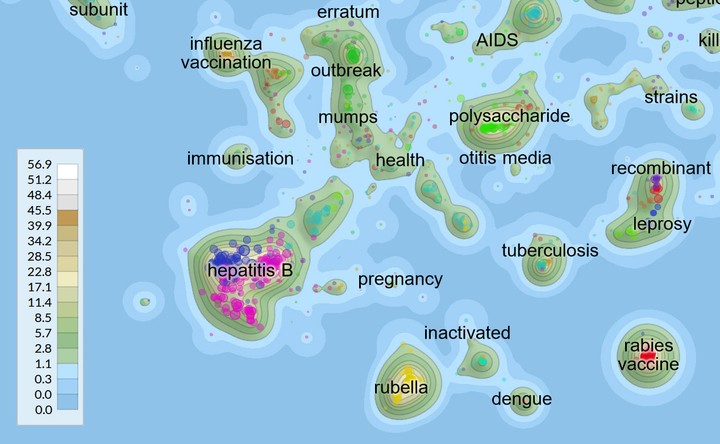
The elevation color legend box added by the Legend plugin.
The Legend plugin does not expose any properties, but it comes with its own
default CSS stylesheets you need to include in your design:
import { DotAtlas, Legend } from "@carrotsearch/dotatlas";
import "@carrotsearch/dotatlas/plugin.legend.css";

const dotAtlas = DotAtlas.with(Legend).embed({
  "element": document.querySelector("#visualization")
});
The stylesheet defines a number of CSS variables you can override to customize the colors and support dark mode:
| CSS variable | Usage |
|---|---|
--dotatlas-legend-background-color |
background color of the legend box |
--dotatlas-legend-background-color-hover |
background color of the highlighted legend box |
--dotatlas-legend-border-color |
border color of the legend box |
Lingo4G
The Lingo4GDocumentMap plugin makes it easy to display the
2d document
embeddings produced by Lingo4G analysis API v2. All you need to do is pass the JSON response received
from Lingo4G API as the plugin's
lingo4g:result property:
import { DotAtlas, Lingo4GDocumentMap } from "@carrotsearch/dotatlas";

// Fetch results from Lingo4G (pseudo code below)
const lingo4GApiUrl = "https://yourserver.com/lingo4g/api/v2";
const result = await fetch(lingo4GApiUrl + "/analysis");

const dotAtlas = DotAtlas.with(Lingo4GDocumentMap).embed({
  "element": document.querySelector("#visualization"),
  "lingo4g:result": result
});
Note that you do not need to specify any map layers,
the plugin creates the elevations, markers and labels layer automatically. You can
use the lingo4g:customize:layers
callback to customize the layers the plugin created.
To get a naturally-looking map, you usually need at least a few thousands of documents in the Lingo4G 2d embedding.
See the Lingo4G plugin reference for a complete list of properties added by this plugin.
To handle responses for Lingo4G analysis API v1, use the Lingo4G v1 plugin.